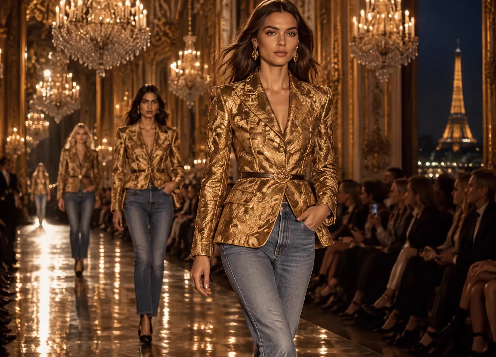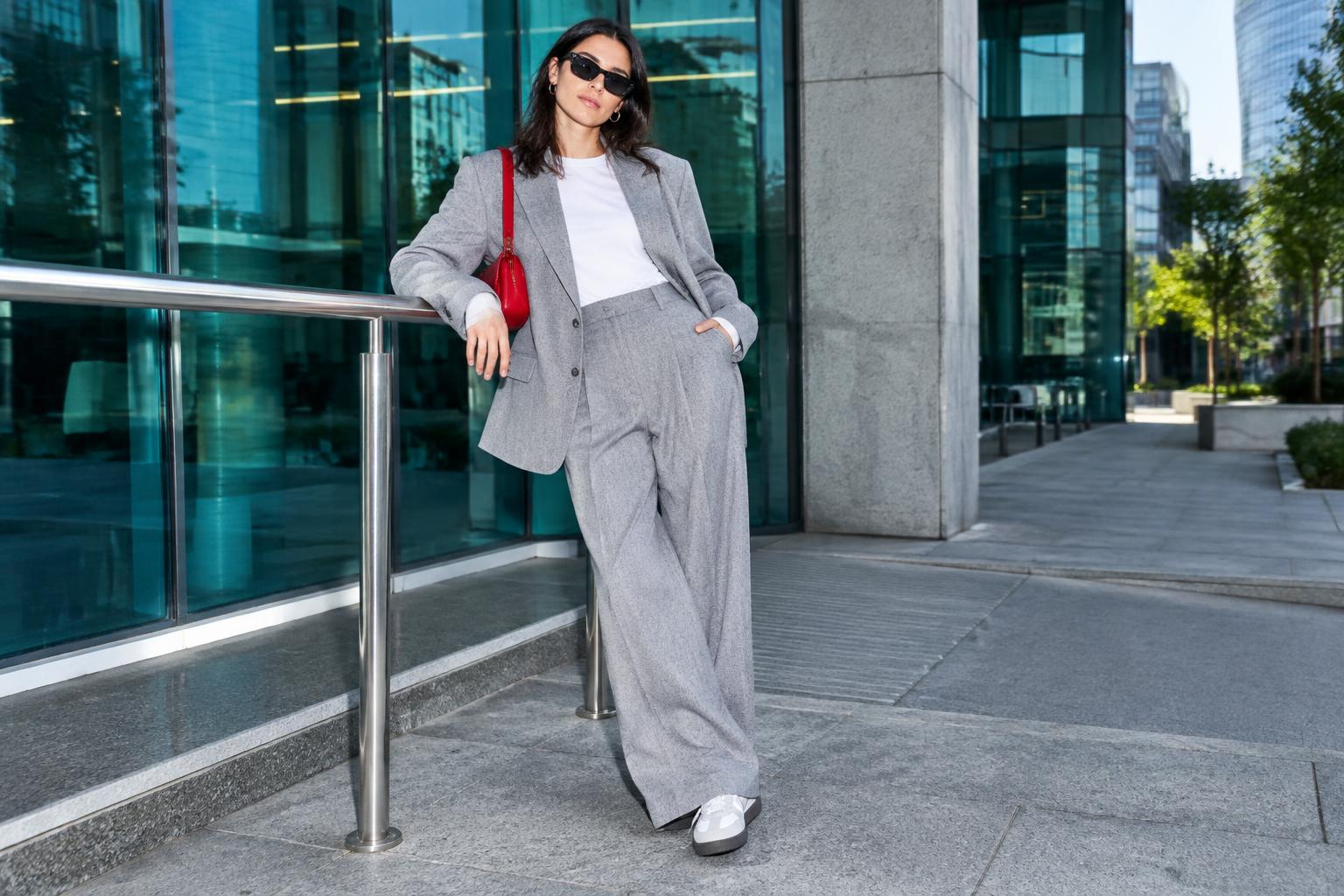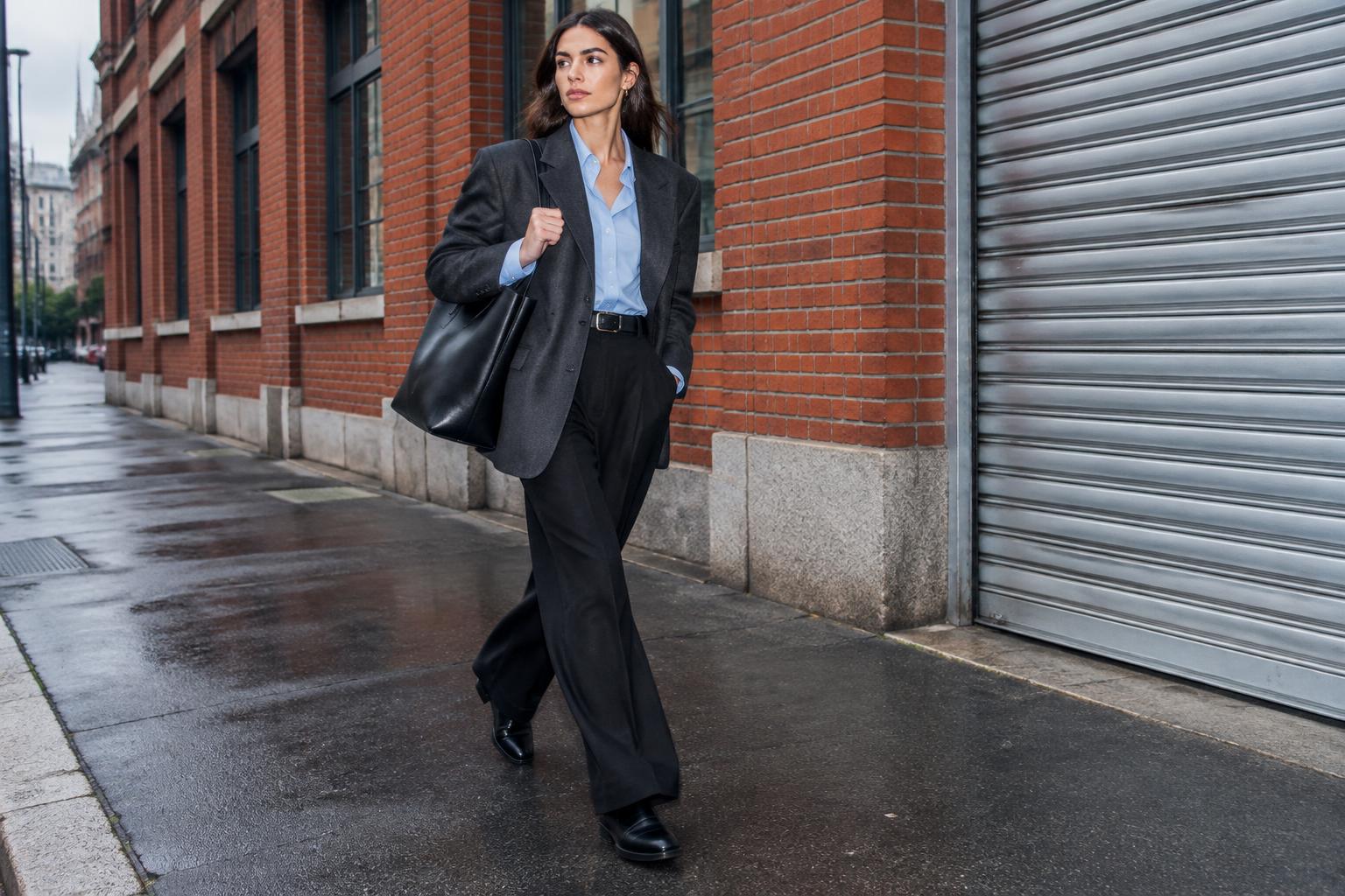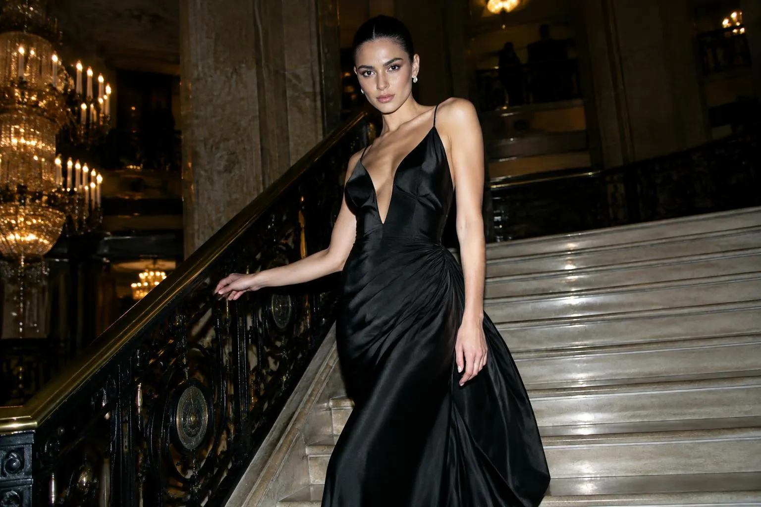
The fashion color trends 2026 story is one of warmth and contrast: rich browns and creamy neutrals on one side, soft buttery pastels and saturated jewel tones on the other. Instead of one dominant hue, the year offers a palette you can mix, and that makes it easier to wear than it looks.
This guide walks through the shades that matter, how they behave across the seasons, how designers and retailers tend to use them and, most importantly, how to wear each color and pair it with what you own. It's late October 2026, so you'll find both what has been worn this year and how to carry it forward.
The Defining Fashion Colors of 2026
Looking across runway coverage, street style and mainstream retailers, a handful of shades show up repeatedly. Treat them as families rather than exact swatches.
Chocolate and Espresso Brown
Brown has moved from "the sensible neutral" to the new black. Deep, slightly red-toned browns look expensive in leather, suede and wool, and they soften a look compared with black. Wear brown on brown for a monochrome outfit, or pair it with cream, camel or soft blue.
Creamy Whites and Butter Tones
Warm whites, ivory and pale butter yellow give outfits a clean, glowing feel. Cream knits, ivory pants and soft yellow tops are easy to layer, though they ask for a bit more care. The butter shade in particular works best near the face, in a top or scarf, so it flatters rather than washes out.
Burgundy, Wine and Oxblood
These dark reds bring richness without the intensity of bright red. They look excellent in leather bags, boots and outerwear, and they pair well with brown, navy and gray.
Greens: Olive, Moss and Forest
Earthy greens are versatile neutrals in disguise. Olive works in utility pieces, while deeper forest green feels dressier. They pair beautifully with cream, tan and black.
Cobalt and Electric Blue
When you want a clear statement, saturated blue delivers. It's most wearable as a single piece, such as a coat, a bag or a knit, against neutral surroundings.
Soft Pastels and Powder Tones
Pale pink, powder blue and mint appear as quiet, slightly dusty shades rather than candy brights. They're ideal for spring and summer dressing, or as a lighter counterpoint to heavy winter textures.
Metallics and Silver
Silver and soft gold continue to work as neutral accents in shoes, bags and jewelry, and in shimmery fabrics for evening.
Spring and Summer Palette
Warm-weather color tends to be lighter, fresher and more playful. The 2026 spring and summer palette is built on soft tones with a few bold notes.
- Light neutrals: ivory, sand and pale stone as a base for everything else.
- Pastels: powder blue, blush and mint, often in sheer or fluid fabrics.
- Butter yellow: a fresh alternative to white in dresses, shirts and knitwear.
- Bright accents: coral, cobalt or grass green as single pieces.
To see how these shades translate into silhouettes, explore our guides to spring fashion trends 2026 and summer fashion trends 2026.
Fall and Winter Palette
Cold-weather color goes deeper, with warm, dark tones that look good in heavier fabrics.
- Brown in many shades: chocolate, mocha, tobacco and camel.
- Burgundy and wine, as the season's richest red.
- Forest and bottle green, which pair with everything.
- Charcoal and slate, a softer option than black.
- Cream and ivory, which keep winter looks from feeling heavy.
If you're building a cold-weather wardrobe, these shades also line up with the coats, knits and boots that dominate stores right now. A single coat in chocolate or burgundy can lift an entire season.
How Designers and Retailers Use Color
Color rarely arrives alone. It's introduced through a few consistent strategies, and learning to recognize them helps you shop and style with more confidence.
- Tonal dressing: head-to-toe variations of one color, such as brown on brown or cream on cream. It reads as polished and lengthens the body.
- The single bold piece: one saturated item, like a cobalt coat, against a neutral outfit.
- Unexpected pairings: combinations like chocolate with powder blue or burgundy with olive, which feel fresh but remain wearable.
- Texture instead of print: a monochrome outfit made interesting by mixing wool, leather, satin and knit.
On mainstream retailers, retailers usually translate runway color into slightly more wearable versions: a deep burgundy instead of a dramatic oxblood, a soft butter instead of a bright lemon. That's good news for everyday wear, since muted versions of a trend color often prove the most versatile.
How to Wear Each Color
| Color | Easiest way to wear it | Pairs well with |
|---|---|---|
| Chocolate brown | Coat, pants or boots | Cream, camel, powder blue |
| Cream and ivory | Knitwear, wide-leg pants | Brown, olive, navy |
| Butter yellow | Top, knit or scarf | Denim, white, chocolate |
| Burgundy | Bag, boots, leather jacket | Gray, navy, olive |
| Olive and forest green | Utility jacket, pants | Cream, tan, black |
| Cobalt blue | One statement piece | Neutrals, brown, white |
| Powder pastels | Shirts, dresses, light knits | White, silver, soft gray |
| Silver and metallics | Shoes, bag, jewelry | Almost everything |
Matching Color to Your Coloring
Skin tone, hair and eye color influence which shades flatter you most. Warm undertones tend to love browns, olive and butter yellow near the face, while cool undertones often shine in cobalt, wine and icy tints. These are guidelines, not rules. If a shade feels harsh near your face, wear it lower down in pants, a skirt or shoes.
Color Pairings That Work
Good pairings take guesswork out of getting dressed. These combinations are reliable:
- Chocolate and cream: calm, classic and warm.
- Burgundy and olive: a rich, earthy contrast.
- Cobalt and camel: bold but balanced.
- Powder blue and brown: soft and unexpected.
- Butter yellow and denim: relaxed and fresh.
- Gray and wine: refined and wearable for work.
A Simple Formula for Wearing Color
Use the 60-30-10 principle: about sixty percent of your outfit in a base neutral, thirty percent in a secondary shade and ten percent in an accent. It keeps looks balanced and stops colors from competing. If you're new to bolder shades, begin with an accent such as a bag or a scarf, then move toward bigger pieces once you feel comfortable.
Gen Z and the Color Conversation
Younger shoppers have pushed color experimentation, mixing unexpected shades and favoring pieces that photograph well and feel personal. For more on that direction, see our coverage of gen z fashion trends 2026. Whatever your age, the lesson is useful: color feels most modern when it's personal, not prescribed.
Building a Capsule Palette
Rather than buying into every shade, build a palette of about five colors that work together. A practical structure:
- Two base neutrals, such as chocolate brown and cream.
- One supporting shade, such as olive or navy.
- One accent, such as burgundy or cobalt.
- One metallic, such as silver for shoes and jewelry.
Most of what you already own probably fits into this structure. Sort your closet by color, identify gaps and fill them gradually. A palette-first approach means almost everything you buy works with something else, which reduces waste and speeds up dressing.
Outfit Ideas by Color
Here are four ready-to-wear combinations that put the palette into practice.
- Work: charcoal pants, a cream knit, a burgundy bag and brown loafers.
- Weekend: straight jeans, an olive jacket, a butter yellow tee and white sneakers.
- Evening: a chocolate satin skirt, a fitted black top, silver sandals and a small metallic bag.
- Spring day: powder blue shirt, ivory pants, tan flats and a cobalt scarf.
Each one uses a base neutral, a supporting shade and a small accent, so you can swap individual pieces without rethinking the entire outfit.
Mistakes to Avoid
- Buying a trend color you never wear near your face. Test it in natural light.
- Mixing too many accent colors. Stick to one bold shade per outfit.
- Ignoring fabric. The same color looks different in matte wool, shiny satin and sheer chiffon.
- Overlooking care. Light shades show stains easily and darker ones can fade, so follow label instructions.
- Treating trend colors as permanent. Some shades will fade from the conversation, so choose them in lower-cost pieces first.
Frequently Asked Questions
What are the main fashion color trends in 2026?
Chocolate brown, cream and butter tones, burgundy and olive or forest green lead the neutrals and darks. Cobalt blue, powder pastels and metallics add contrast and freshness.
Is black still in style?
Yes. Black remains a staple, but brown, charcoal and deep burgundy are increasingly used as alternatives, especially in outerwear, leather and boots.
How do I wear a color I'm unsure about?
Start with an accessory, such as a scarf, bag or shoe. If it works, move to a knit or top, then to bigger pieces. Pair the new shade with neutrals you already own.
What colors go with brown?
Cream, camel, powder blue, olive, burgundy and butter yellow are all reliable. Chocolate and cream is the simplest, most polished pairing.
The Bottom Line
The fashion color trends 2026 are friendly: warm browns, creamy neutrals, deep reds and greens, with soft pastels and a few vivid accents. Pick two or three that suit you, anchor them with neutrals and explore from there. For a broader view of how color fits into the year's styles, read our guide to fashion trends 2026, or browse everything in Colors.