Wedding colour schemes are easy to fall in love with and surprisingly hard to get right. A palette that looks wonderful on a screen can turn flat in a stone church, harsh under marquee lighting or muddy in a grey British November. The aim is not to find the trendiest combination, but one that suits your venue, your season and your own taste.
This guide shows how to build wedding colour schemes in a few clear steps: where to start, how to balance colours, which combinations tend to work for each season, and how to avoid the common slips.
Start with what you cannot change
The most helpful palettes begin with the fixed elements of the day, not a mood board.
- The venue. Look at the walls, floors, curtains, carpets and woodwork. A venue with warm stone or red brick will clash with some cool tones. A white-walled gallery can take bolder colour.
- The season and light. Spring and summer daylight is bright and clear. Autumn and winter light is softer and warmer, and many receptions take place by candlelight.
- The landscape. If you are marrying outdoors, notice the greens, blues and earth tones around you.
- Your outfits. The colour of your clothes, and those of your wedding party, appears in nearly every photograph.
Visit the venue at a similar time of day to your reception, if possible, and take photographs. Hold colour samples against the space to see how they behave.
The three-part formula
A wedding palette usually works best with a clear structure:
- A base neutral. White, ivory, cream, stone or soft grey. This anchors the scheme and appears in linen, stationery and clothing.
- One or two main colours. These set the personality. They appear in flowers, accents and bridesmaid or groomsmen outfits.
- One accent. A smaller dose of something that adds depth, such as a metallic, a darker shade or a contrasting hue.
This structure gives you freedom without chaos. When you are tempted to add a fourth or fifth colour, ask whether it earns its place or only complicates things.
Tone matters as much as colour
Two shades labelled the same colour can look very different. Pay attention to whether a colour is warm or cool, muted or saturated, light or deep. A palette feels more sophisticated when tones share the same energy. Soft, dusty shades sit well together, as do rich, deep ones. Mixing pale pastels with intense jewel tones can feel jarring unless done deliberately.
Wedding colour schemes by season
Spring
Soft and fresh palettes suit spring: pale greens, blossom pink, buttery yellow, powder blue and lilac. Combine them with white or cream so they stay light. Spring flowers such as tulips, ranunculus and narcissi naturally provide this range.
Summer
Summer can take brighter colour. Think coral and sage, cornflower blue with white, or peach and apricot with deep green. Outdoor weddings in strong light can handle bolder choices, while very pale colours may wash out.
Autumn
Autumn schemes draw on the changing landscape: terracotta, rust, burnt orange, mustard, deep plum, burgundy, olive and bottle green. These work well with warm neutrals and brass or copper details. Candlelight deepens the effect.
Winter
Winter palettes can be dramatic or quiet. Deep green with berry red and gold feels traditional and festive. Navy with silver and ice blue feels crisp. Charcoal, ivory and a touch of blush offers a more understated alternative.
Combinations that tend to work
These are directions rather than prescriptions. Adapt the proportions and tones to your own setting.
| Mood | Base | Main colours | Accent |
|---|---|---|---|
| Soft and romantic | Ivory | Blush, dusty rose | Sage green |
| Fresh and garden-like | White | Sage, pale yellow | Soft peach |
| Warm and earthy | Cream | Terracotta, olive | Brass |
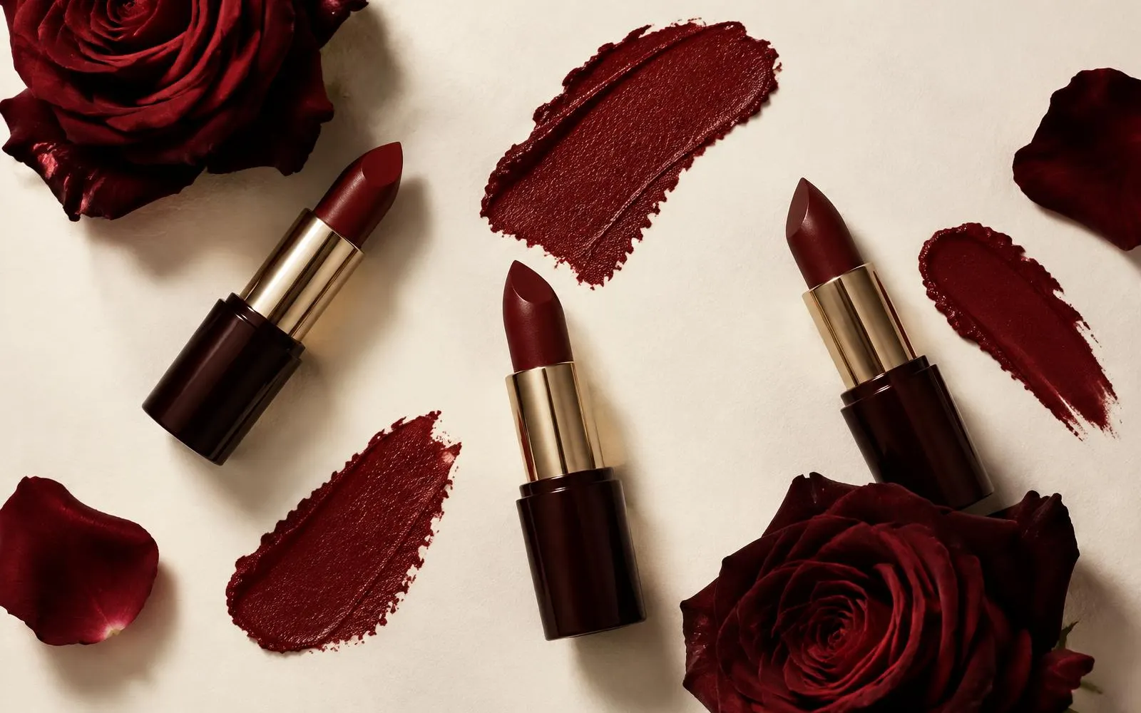
| Rich and moody | Stone | Burgundy, deep green | Antique gold |
| Crisp and classic | White | Navy, light blue | Silver |
| Modern and minimal | Grey, white | Black, charcoal | A single bright colour |
How to apply your palette
A wedding colour scheme must be carried through the day without looking forced.
Flowers and greenery
Flowers do the bulk of the colour work. Ask your florist what is in season, since out-of-season varieties can be harder to source and less reliable. Greenery counts as a colour too, and different foliage has different shades, from silvery eucalyptus to deep ivy.
Stationery
Invitations are the first sign of your scheme. Use your base neutral for the paper and one main colour for text or illustration, rather than printing every colour on every item.
Table styling
Linen, glassware, candles and napkins give you an easy way to use colour without overpowering a room. For specific layout and centrepiece ideas, see our guide to wedding table decorations.
Clothing
The wedding party's outfits are often the strongest colour statement. Bridesmaids and groomsmen do not have to match exactly. A shared colour family, with different cuts or shades, often looks more natural and is kinder to different body shapes and budgets.
Guest clothing
Guests will look to your invitation for guidance. A short line on dress code or colours to avoid is helpful. If you want to point them in the right direction, our guide to wedding guest outfits covers what suits different venues, seasons and levels of formality.
Hair and beauty
Your palette can inform hair accessories, make-up and floral details. Fresh flowers, ribbons and pins can pick up one colour from your scheme. For inspiration, see our edits of wedding hairstyles and wedding guest hairstyles, then check how accessories will look against your outfit.
Practical considerations
- Test in real light. Screens, printed samples and fabric swatches all look different from each other.
- Get fabric samples. Order swatches for bridesmaid outfits, napkins and linen, and compare them against flowers.
- Be careful with white. White, ivory, cream and champagne can clash when placed together. Choose one family and keep it consistent.
- Consider photographs. Very bright neon colours and very dark tones can photograph differently from real life. Ask your photographer about their experience.
- Think about stains. Some colours show red wine and mud more than others, which matters for table linen and long dresses.
- Budget for variation. Dye lots, flower varieties and print colours may vary slightly, so allow for it.
UK-specific considerations
- Weather. A grey sky changes how colour appears outdoors. Rich, warm tones usually hold up better than very pale ones.
- Venue restrictions. Many historic UK venues have strict rules about what can be attached to walls or placed near antiques, which can limit big colour statements.
- Seasonal availability. British-grown flowers follow a natural calendar. If you want homegrown flowers, let your palette follow what is blooming.
- Light levels. Short winter days mean your reception will probably be in candlelight or artificial light. Choose colours that glow under warm lighting.
Budget-friendly colour choices
- Choose a neutral base and spend colour in only a few places.
- Use greenery as a main colour, as it is often less expensive than flowers.
- Repeat the same colour across several items, such as ribbons, napkins and stationery, to create impact.
- Rent or borrow linen and glassware in your palette instead of buying.
- Let seasonal flowers decide your colours rather than the other way round.
Common mistakes to avoid
- Choosing too many colours. More than three or four usually reads as busy.
- Copying a palette without checking the venue. It may not suit your space.
- Ignoring undertones. A cool pink beside a warm coral can look off.
- Matching everything exactly. Slight variation feels more natural than perfect uniformity.
- Forgetting your own comfort. If you dislike a colour, you will see it in every photograph.
- Following a trend for its own sake. Pick colours you will still like in ten years.
Frequently asked questions
How many colours should a wedding colour scheme have?
Two to three main colours plus a neutral is a reliable guide. A base neutral, one or two main colours and a single accent give variety without feeling cluttered. More than this can work, but it needs careful balance.
What are the best wedding colour schemes for autumn?
Terracotta, rust, burgundy, mustard, olive and deep plum all suit autumn. They look rich against warm neutrals and brass accents, and candlelight deepens them. Choose a lead colour and use others in smaller amounts.
Do bridesmaids' dresses have to match the colour scheme?
They do not need to match exactly. A shared colour family, with different shades or styles, often looks more relaxed and flatters more people. Whatever you choose, test fabrics together in daylight before ordering.
Should I choose my colour scheme before or after the venue?
After. The venue's architecture, lighting and existing colours will affect which palettes work. Once the venue is booked, visit again with swatches and test them in the space.
In summary: keep it simple and let the venue guide you
The strongest wedding colour schemes use a calm neutral, a small number of colours and tones that share the same mood. Check your choices against the venue and light, then repeat them with restraint. For ideas on every part of planning, explore our Wedding section.